So for about the past year and a half, I’ve been neck deep in the world of Asian pens (thanks to guys like Chris Rap and Frank Underwater). Most of these have been pens coming out of China, but a few have been out of Taiwan (hello Twsbi!), Japan (Pilot Metropolitans(s) and (s) and (s)) and just recently, India. It was actually because of some Indian pens I’d purchased that I came across this newest jem, the Wancher Ryuko demonstrator from Japan.
I was perusing the web site of Fountain Pen Revolution, owned and run by a guy named Kevin Thiemann. Side note – I don’t know Kevin “from Adam”, but he has a great web site with both vintage and new pens, many from India and Japan. You should check it out. I had recently ordered a Ranga pen (review to come) from him and was looking to see if there was something else that would make me more financially insolvent. Low and behold, I ran across the Wancher line of pens. They carry two lines, the Zen Sansui, and the Ryuko Demonstrator.
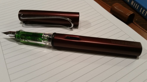
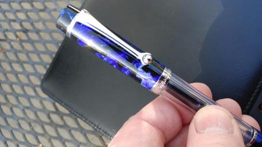
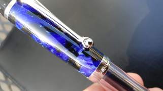 I chose the Ryuko for a (probably) very oddball reason. The clip. For years, I’ve wanted a pen that has a roller ball-tipped clip, much like vintage Wahl pens or some of the current Delta models. This pen hit all the check marks for me. I chose the blue version -that was tough as I have a thing for orange- it also comes in green and orange.
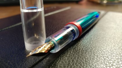
The Ryuko is a flat top in design and harkens back to the Parker Duofold. It’s a demonstrator, but, I would say, a version of a demonstrator, as it has a solid cap and end piece. The resin is absolutely beautiful. It appears to be turned as opposed to injection molded. The polish job is outstanding as well. It takes international cartridges and comes with a converter as well. But it’s also designed to be used as an eyedropper and comes with a bulb syringe for that purpose. This is a fairly substantial pen, here are some of it’s dimensions:
- 14.5 cm capped
- 18.3 mm posted
- 1.5 cm girth for the cap
- 1.2 cm girth at the widest part of the barrel
Some folks have definite preferences in terms of posting – or not posting – their pens. And while this pen posts securely, it doesn’t post deeply and therefore makes for a VERY long pen posted. I usually do post my pens, but not this one as it’s just too long for me and throws the balance of the pen off a bit. And I have fairly large hands.
For me, it’s the business end of this pen that really makes it shine. These pens are shipped with German Jowo steel nibs, and mine, a medium, is fantastic! It’s buttery smooth with just the slightest hint of feedback. However, if you’re looking for something soft or some flex, I’d look elsewhere.
To sum things up, the Wancher line of pens is one that I think deserves some time in the spotlight. The Ryuko model retails for $78 US at the time of this writing, via Fountain Pen Revolution. I’m sure it’s available through other outlets, but I haven’t researched that at this time. It’s a great pen as a “step up” from some of the more entry level choices of pens available today. Pick one up. I dare say you won’t be disappointed!


A companion video to the review:
 I run all my calendar information through Google Calendar. Everything. Multiple calendars for work and home and the ability to share with my wife and kids. All my note taking is done in a notebook, and later scanned into Evernote.